The Architect of Azeroth
The Art of Brütal: Inside the Creative Legacy of Sam “Samwise” Didier

An example image signature for the first image.
Sam “Samwise” Didier isn’t just an artist—he’s one of the architects of modern gaming’s most recognizable look. For more than 30 years at Blizzard Entertainment, Didier shaped the worlds of Warcraft, StarCraft, and Diablo.
He joined the studio in 1991, back when it was still called Silicon & Synapse, and retired in late 2023.
With his departure, the timing feels right to look back at the bold, brütal aesthetic he pioneered, the technical thinking behind it, and why his work continues to influence game art across the industry.
From Pulp to Pixels: The Blizzard House Style
Sam Didier’s entry into the games industry could have been a punchline. In 1991, he opened the classifieds and saw an ad that read only: “make art for video games.” “Very descriptive,” he later laughed. “I think a programmer wrote it.” The company behind the ad was Silicon & Synapse, a scrappy Irvine studio with fewer than a dozen employees. Didier showed up with a portfolio under his arm, and that was enough. He was hired, his desk wedged between humming CRT monitors and stacks of floppy disks.
It was there, in that cramped office, that Didier says he “grew up.” What started as just a job quickly became his second home. “I found out I had a family I didn’t even know I had,” he reflected decades later. Alongside coworkers who would eventually shape some of gaming’s most iconic worlds, Didier learned nearly everything that would define his career. He had arrived knowing only the Atari 2600 and Nintendo; within months, he was learning Photoshop for the first time, figuring out how to design user interfaces, and cranking out thousands of clickable buttons. He taught himself how to turn pencil sketches into 3D models, texture them, animate them, and even make them shoot fireballs or lasers across a screen.
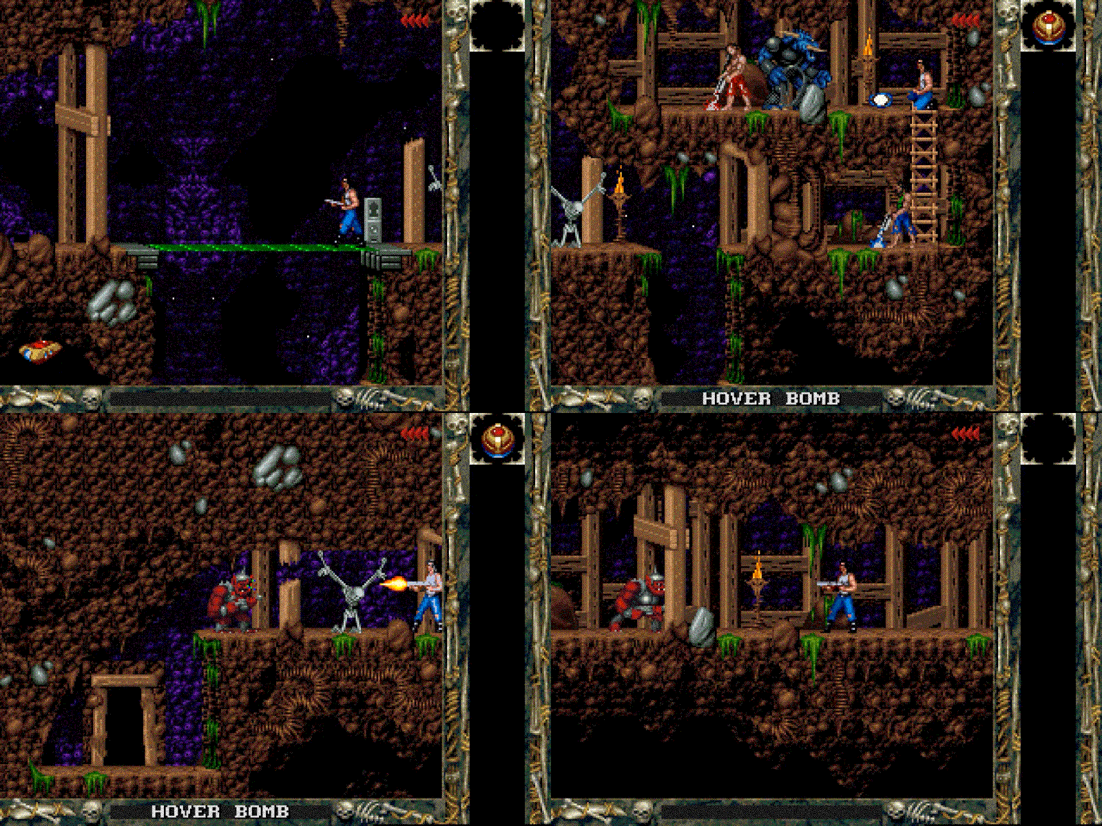
His early contributions on The Lost Vikings (1992) and Blackthorne (1994) carried the fingerprints of his influences: pulp comics, Dungeons & Dragons sketchbooks, and a taste for bold, simplified forms. He worked almost exclusively in pencil then, scanning his drawings into primitive digital tools to be colored pixel by pixel with a mouse.

An example image signature for the first image.
From these modest beginnings, Blizzard’s “house style” emerged. It was big, bold, colorful, and unapologetically exaggerated — a look Didier once compared to pulp comics, where heroes had massive shoulders, weapons oversized to the point of absurdity, and always a streak of humor.
As he put it: “We haven’t changed our style since the very beginning. It’s always been over-the-top, over-proportioned, and colorful — with as much comic factor as we can add.”
Critics and fans alike summed it up in shorthand: gigantic hands, tiny heads, chunky armor, and characters that radiated larger-than-life heroism even before the player clicked “Start.”
